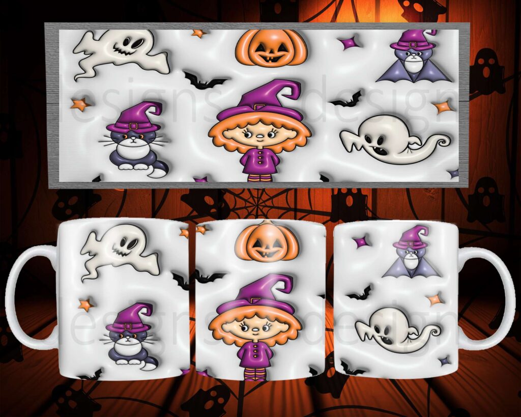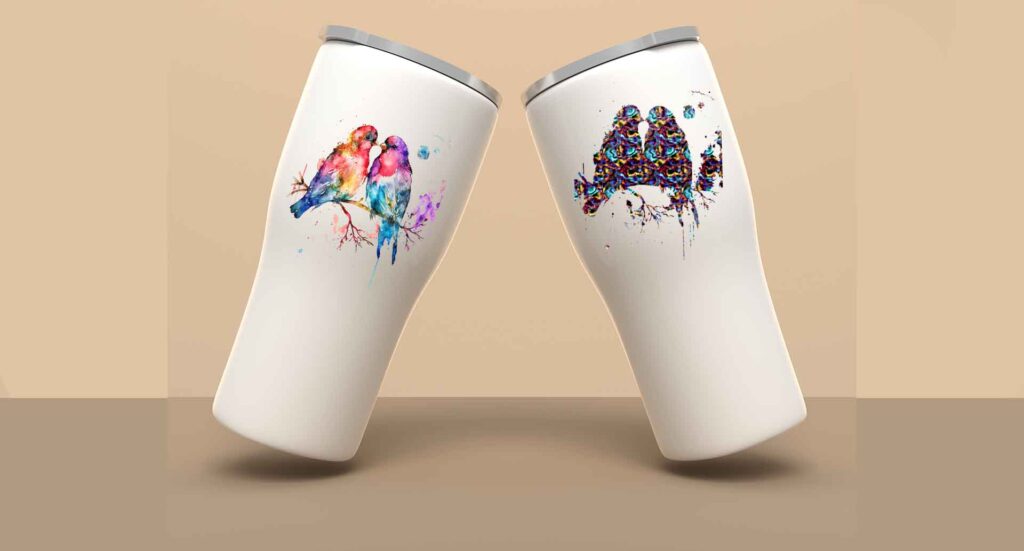
Welcome to sublimation printing, Why does sublimation Print have a Different Color Than the Given Design
” Fear not, my friend! We’re about to embark on a journey through the twists and turns of sublimation mysteries, uncovering each reason and throwing in some wizard-like solutions to make sure your prints are as dazzling as your imagination intended.
Color Discrepancies Due to Design Software:
The Scoop: So, your design software might not be the perfect translator for sublimation colors. It happens!
Pro Tip: Let’s tweak those design software settings to cozy up with sublimation color profiles. We want those colors to be best friends.
Variations in Substrate Composition:
Behind the Curtain: Different substrates have their own way of soaking up sublimation inks. No judgment here; they’re just being themselves!
Ninja Move: Test sublimation on sample substrates, doing a little dance with color profiles based on the material. It’s all about finding that sweet spot.
Impact of Heat Press Settings:
The Drama: Imagine the heat press as the director of your color show. Sometimes it gets a bit carried away and changes the plot.
Fix It: Be the director! Fine-tune those heat press settings until your colors take the stage just right.
Printer Calibration for Color Accuracy:
Printer Chronicles: Printers can sometimes be rebels, not following the script. Calibration issues, you know?
Wizardry: Regularly calibrate your printer – it’s like giving it a pep talk to play the colors as they are on the script.
Influence of Humidity on Sublimation:
Weather Talk: Humidity, the uninvited guest at the sublimation party, causing color mischief.
Control Tower: Keep the humidity in check, create the perfect party atmosphere, and let those colors dance without any hiccups.
Quality of Sublimation Inks:
Ink Chronicles: Not all inks are born equal. Some are superstar-quality; others are more like supporting actors.
Red Carpet Move: Invest in the A-list sublimation inks – the ones that make your colors shine like Hollywood stars.
Design Resolution and Detailing:
Pixel Drama: Low design resolution is like a pixel rebellion, causing color details to vanish in thin air.
Pixel Magic: Design in high resolution, keep those pixels in check, and watch the color details steal the spotlight.
Material Pre-Treatment Variations:
Pre-Treatment Chronicles: Materials sometimes have preferences. Some like a little pre-treatment; others don’t.
Material Charm: Ensure a consistent pre-treatment ritual across materials, making sure they’re all ready to soak in those colors.
Closing Scene:
So there you have it, the grand finale of our sublimation color journey! Armed with these insights and a bit of wizardry, you’re ready to create a spectacle where your prints shine in all their color glory. Here’s to the magic of sublimation! 🌈✨